THE PROBLEM
The existing website was outdated, difficult to navigate, and lacked structure,
leading to a confusing user experience that likely discouraged new visitors
THE SOLUTION
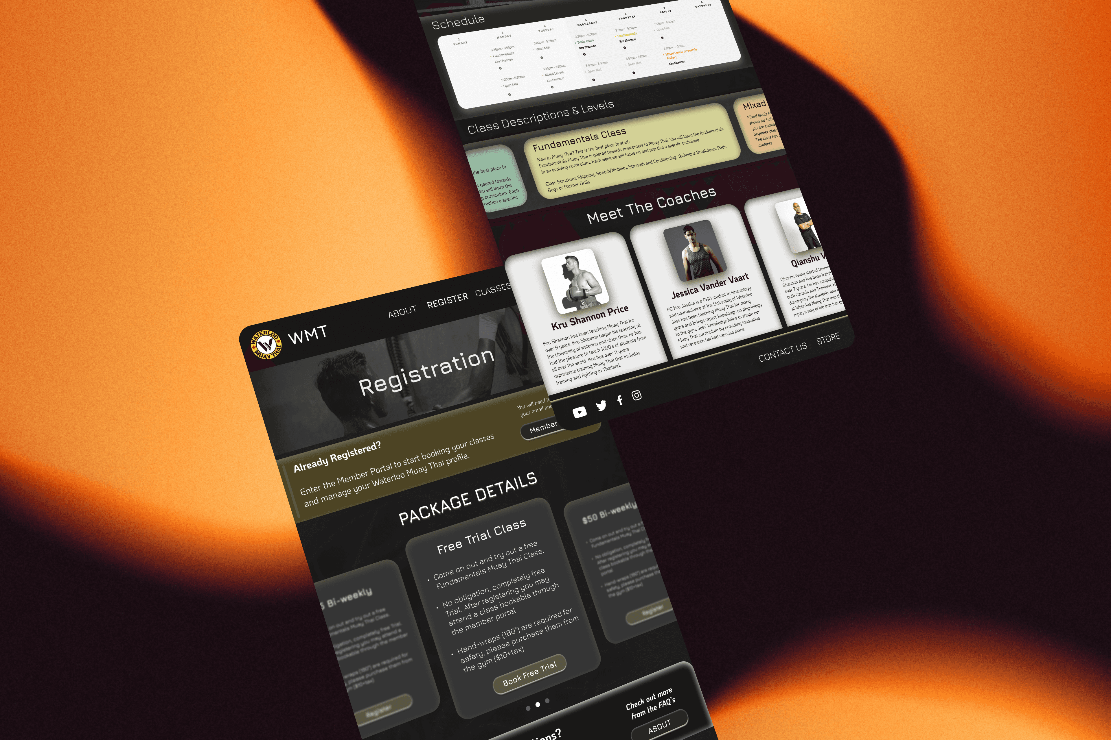
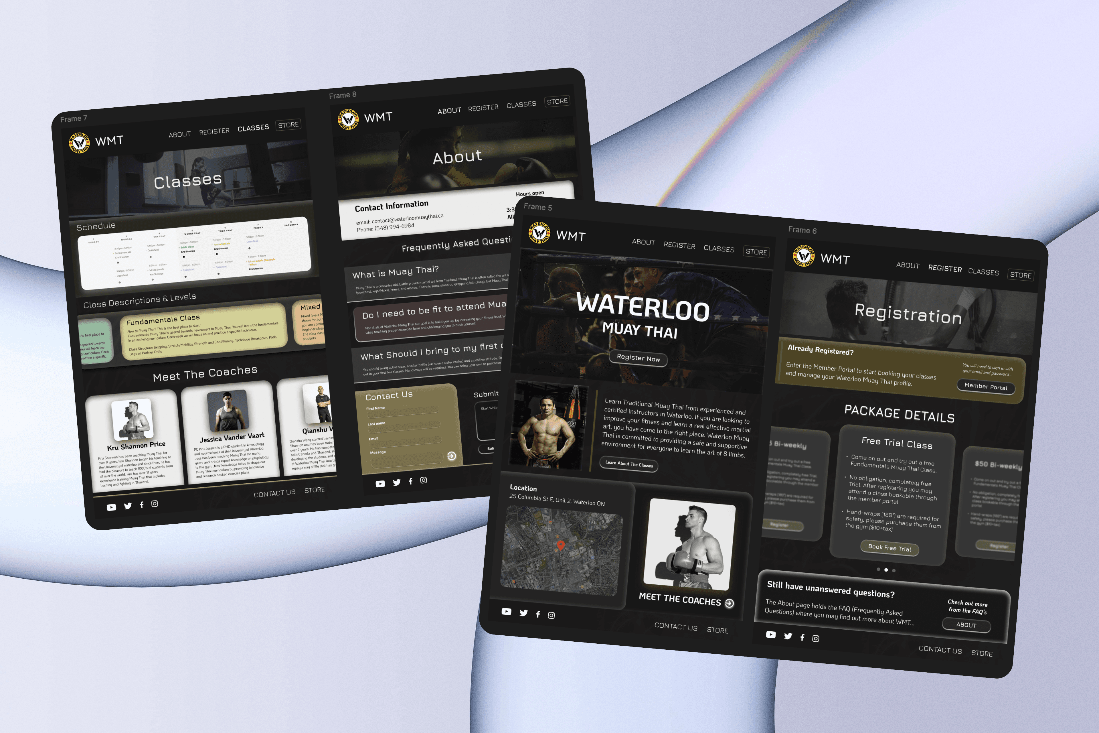
Final Prototypes

User Interface Designer, Brand Designer, Product Designer, Website Critique, Market Research
After analyzing the current Waterloo Muay Thai Website, I encountered many pain points which lead to numerous of potential clients, straying away from the gym. I designed the website, attacking all the pain points to ensure the Gym has the best chance at maximizing their revenue through Website Sales.
WMT Website Redesign
OVERVIEW
2025 Website Critique & Redesign
Date
My Role
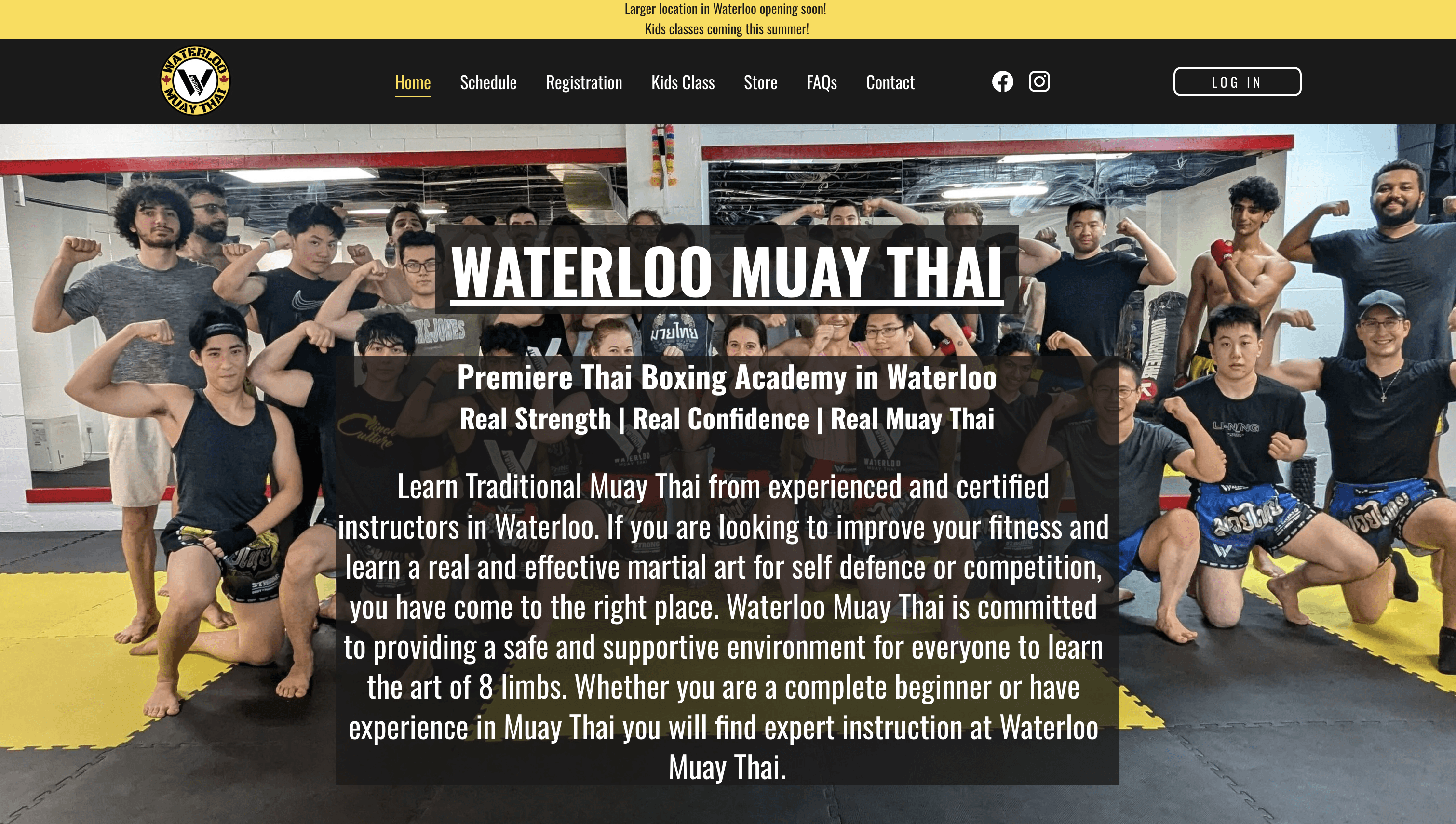
Current Website (Was Redesigned Recently) https://waterloomuaythai.ca/
THANK YOU!
Take a look at my other case studies.
My Projects
The previous Waterloo Muay Thai website lacked a clear visual hierarchy, as everything was cluttered. This made it hard for users to navigate. Things such as overlapping buttons, boring fonts, and a horrible contrast of white and black, created a confusing experience that didn’t reflect the brand’s professionalism. In fact, key features like the store link and call-to-action buttons were misplaced or visually weak.
The website also struggled with proper content. Trainer images were too small, and class information was buried within the website or even just hard to access quickly. Time is important for first impressions! The site felt outdated, and while the gym still attracted members, the experience likely turned away visitors who were on the fence.
Pain Points
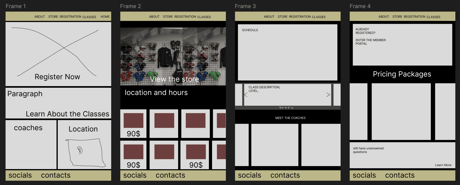
Low-Fidelity Prototypes
Design the Solution
Visual Design & Layout
Redesigned the site with a bolder and more modern aesthetic, removed detrimental contrast colors that it previously had, visual hierarchy, and typography
Streamlined Navigation
Fixed and reorganized buttons and content into a clear structure with good user flow that makes it easy for key actions such as class sign-up, contact, and browsing schedules.Content Clarity & Impact
Used bigger and more high-resolution images and improved the class schedule presentation by using a clear layout and a good strong call-to-action placement.Elevated Brand Presence
Modernized the site’s tone and structure to reflect professionalism, which allows users to gain trust for where they are putting their money. This converts new users from interest into action.